Matplotlib is highly customizable, and having a huge code base means it might not be easy to find what I need quickly.
A recurring problem that I often face is customizing figure legend. Although Matplotlib website provides excellent document, I decided to write down some tricks that I found useful on the topic of handling figure legends.
First, as always, load useful libraries and enable matplotlib magic.
%matplotlib inline

import matplotlib.pyplot as plt
import matplotlib.patches as mpatches
import seaborn as sns
from itertools import izip
import pandas as pd
import numpy as np
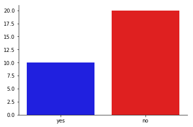
The first thing I found useful is to create a figure legend out of nowhere.
In this example, I synthesized poll data with ‘yes’ or ‘no’ as the only choices, and try to plot color-coded bar graph from these two data points.
ax = plt.subplot(111)
answers = ['yes','no']
votes = [10,20]
colors = ['blue','red']
sns.barplot(x=answers, y = votes, palette=colors, ax=ax)
sns.despine()
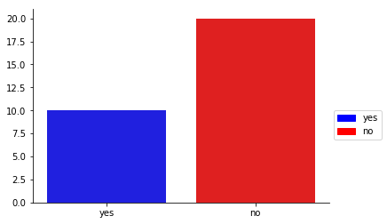
On the above plot, legend could not be added using ax.legend(), since they were not labeled. In this case, I have to use patches from matplotlib to make the legend handles, and add to the figure by ax.legend()
ax = plt.subplot(111)
answers = ['yes','no']
votes = [10,20]
sns.barplot(x=answers, y = votes, palette=colors, ax=ax)
sns.despine()
pat = [mpatches.Patch(color=col, label=lab) for col, lab in zip(colors, answers)]
ax.legend(handles=pat, bbox_to_anchor = (1,0.5))
Another frequently-encountered problem is the duplicate legend labels.
To illustrate this problem, I simulated a dataset of movements of 10 particles of two particle types bwtween two time points in a 2D space (x1, y1 are the initial coordinates; x2, y2 are the new coordinates; label indicates the particle types). I also wrote a color encoder function for assigning distintive color to each particle type.
def color_encoder(xs, colors=sns.color_palette('Dark2',8)):
    '''
    color encoding a categoric vector
    '''
    xs = pd.Series(xs)
    encoder = {x:col for x, col in izip(xs.unique(), colors)}
    return xs.map(encoder)

sim = pd.DataFrame(np.random.rand(10,4), columns = ['x1','x2', 'y1','y2']) \
    .assign(label = lambda d: np.random.binomial(1, 0.5, 10)) \
    .assign(color = lambda d: color_encoder(d.label))
sim.head()
| x1 | x2 | y1 | y2 | label | color | |
|---|---|---|---|---|---|---|
| 0 | 0.902625 | 0.755530 | 0.211558 | 0.512878 | 1 | (0.105882352941, 0.619607843137, 0.466666666667) |
| 1 | 0.327010 | 0.275663 | 0.876240 | 0.821259 | 1 | (0.105882352941, 0.619607843137, 0.466666666667) |
| 2 | 0.193913 | 0.934108 | 0.746931 | 0.826095 | 1 | (0.105882352941, 0.619607843137, 0.466666666667) |
| 3 | 0.190888 | 0.263192 | 0.331592 | 0.081737 | 0 | (0.850980392157, 0.372549019608, 0.0078431372549) |
| 4 | 0.884696 | 0.221513 | 0.346046 | 0.071234 | 0 | (0.850980392157, 0.372549019608, 0.0078431372549) |
To plot the movement, I iterated over the pandas DataFrame object and plotted a line between the initial and the new coodinate for each particle at a time.
fig = plt.figure()
ax = fig.add_subplot(111)
for index , row in sim.iterrows():
    ax.plot([row['x1'], row['x2']], [row['y1'],row['y2']],
               label = row['label'],
               color = row['color'])
ax.legend()
sns.despine()
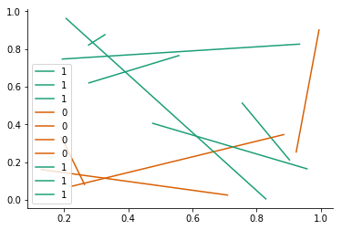
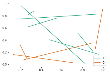
And the default legend produced one handler for each line. To simplify the legend, I found an elegant solution on stackoverflow, that used dict object in python to remove redundant legend labels.
fig = plt.figure()
ax = fig.add_subplot(111)
for index , row in sim.iterrows():
    ax.plot([row['x1'], row['x2']], [row['y1'],row['y2']],
               label = row['label'],
               color = row['color'])
ax.legend()
handles, labels = ax.get_legend_handles_labels()
lgd = dict(zip(labels, handles))
ax.legend(lgd.values(), lgd.keys())
sns.despine()
There’s no doubt R is much better in figure plotting, thanks to ggplot2. But in my use case, I found python much more flexible in many other ways, such as text processing, and building useful software. In python, there are several attempts on building grammar of graphics, such as ggpy, Altair and plotnine. Out of these packages, I have tried plotnine. It is a fairly new pacakge and is coming close, but as of this point it is still not comparable to ggplot2 in R.
I have implemented a color encoder in python for better color controls:
from sequencing_tools.viz_tools import color_encoder, okabeito_palette

ax = plt.subplot(111)
ce = color_encoder()   # initiate the encoder
colors = ce.fit_transform(answers, okabeito_palette())  # fit categories to colors
sns.barplot(x=answers, y = votes, palette=colors, ax=ax)
sns.despine()
pat = [mpatches.Patch(color=col, label=lab) for lab, col in ce.encoder.items()] # ce.encoder is a dictionary of {label:color}
ax.legend(handles=pat, bbox_to_anchor = (1,0.5))
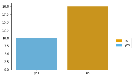
ce.encoder # {'no': '#E69F00', 'yes': '#56B4E9'}
