The other day, I had a conversation with some friends on the hot weather in Ausin, TX. I always thought the hottest hours is around noon when the sun is closest, but we all agreed it feels soooo hot when we get off from work.
So I decided to use data to answer this question. Fortunately, National Centers for Environmental Information hosted cleaned-hourly-temperature data on their ftp server.
%matplotlib inline

import matplotlib.pyplot as plt
import seaborn as sns
import pandas as pd
import time
from operator import itemgetter
from functools import partial
import urllib2
sns.set_style('white')
They even have the header definitions.
def get_header():
    header = 'ftp://ftp.ncdc.noaa.gov/pub/data/uscrn/products/hourly02/HEADERS.txt'
    header = pd.read_table(header, sep= ' ')
    return header.iloc[0,:-1]
To correct for seasonal changes in daily temperature throughout the year, I will define normalized daily temperature as:
\[\frac{T_{h} - \displaystyle \min_{T_1,\dots T_{24}}}{\displaystyle \max_{T_1,\dots T_{24}}-\displaystyle \min_{T_1,\dots T_{24}}}\]where \(T_{h}\) is the temperature of the hour (h) with h = 1, 2, 3, … 24.
def scaling(x):
    x = (x-x.min())/(x.max() - x.min())
    return x
The data are stored yearly, so let’s define a function to read the table from the ftp using pandas, which extracts the date of record, hour of record and hourly temperatures from the tables. The temperature are then normalized daily and the hourly average of normalized temperatures were taken for every day data point. Note that null data (missing data) in the dataset is represented by -9999.
def get_year_date(headers, year):
    url = 'ftp://ftp.ncdc.noaa.gov/pub/data/uscrn/products/hourly02/{year}/CRNH0203-{year}-TX_Austin_33_NW.txt'.format(year = year)
    print 'Getting: %s' %url
    df = pd.read_table(url, sep='\s+',
            names = itemgetter(3,4,8)(headers),
            usecols=[3,4,8]) \
        .query('T_CALC > -9999')\
        .assign(month = lambda d: d.LST_DATE.astype('string').str.slice(4,6)) \
        .assign(normalized_temp = lambda d: d.groupby('LST_DATE', as_index=False)['T_CALC']\
                .transform(scaling)) \
        .groupby(['LST_TIME','month'],as_index=False) \
        .mean()  \
        .assign(year = year) \
        .assign(month_label = lambda d: d.month.map(month_label))
    print 'Downloaded weather from: %i' %year
    return df

month_label = {'01': 'Jan', '02': 'Feb', '03': 'Mrch', '04': 'April', '05': 'May',
            '06': 'Jun', '07': 'Jul', '08': 'Aug', '09': 'Sep', '10': 'Nov', '12': 'Dec'}
So I will analyze temperature for 5 years from 2013, which is the year that I moved to Austin.
headers = get_header()
years = range(2013, 2018)
get_year = partial(get_year_date, headers)

df = map(get_year, years)
df = pd.concat(df, axis=0)
Getting: ftp://ftp.ncdc.noaa.gov/pub/data/uscrn/products/hourly02/2013/CRNH0203-2013-TX_Austin_33_NW.txt
Downloaded weather from: 2013
Getting: ftp://ftp.ncdc.noaa.gov/pub/data/uscrn/products/hourly02/2014/CRNH0203-2014-TX_Austin_33_NW.txt
Downloaded weather from: 2014
Getting: ftp://ftp.ncdc.noaa.gov/pub/data/uscrn/products/hourly02/2015/CRNH0203-2015-TX_Austin_33_NW.txt
Downloaded weather from: 2015
Getting: ftp://ftp.ncdc.noaa.gov/pub/data/uscrn/products/hourly02/2016/CRNH0203-2016-TX_Austin_33_NW.txt
Downloaded weather from: 2016
Getting: ftp://ftp.ncdc.noaa.gov/pub/data/uscrn/products/hourly02/2017/CRNH0203-2017-TX_Austin_33_NW.txt
Downloaded weather from: 2017
Let’s look at the distribution of temperature in Austin throughout the last 5 years.
plt.rc('xtick',labelsize=20)
plt.rc('ytick',labelsize=20)
fig=plt.figure(figsize=(8,4))
ax=fig.add_subplot(111)
sns.distplot(df.T_CALC, hist=False, ax = ax)
ax.spines['top'].set_visible(False)
ax.spines['right'].set_visible(False)
ax.set_xlabel('Temperature', fontsize=20)
ax.set_ylabel('Density', fontsize=20)
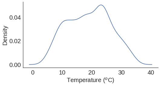
Mostly around 22 \(^o\)C, actually it’s not as bad as I thought! Although the data is measured 24 hours a day and it is mostly hotter when it is in the day, that can explain why we think it is always so hot (>27\(^o\)C) here.
df = df\
    .groupby(['LST_TIME','month','month_label'], as_index=False)\
    .agg({'normalized_temp':'mean'}) \
    .sort_values(['month', 'LST_TIME'])
with sns.plotting_context('paper',font_scale=2):
    p = sns.FacetGrid(data = df,
                  hue='month_label',
                  size=7,
                  palette=sns.color_palette('Set3',12))
p.map(plt.plot,'LST_TIME', 'normalized_temp')
plt.legend(bbox_to_anchor=(1,0.8),title=' ', fontsize=15)
plt.vlines(x=1200, ymin=0,ymax=1, color='red')
p.set(xlabel = 'Hour of the day',
    ylabel=r"""Normalized temperature
    ($\frac{T - min(T)}{max(T)-min(T)}$)""",
)
labels = range(0,2401,300)
for ax in p.axes.flat:
    ax.xaxis.set_ticks(labels)
    ax.set_xticklabels(labels, rotation=90)
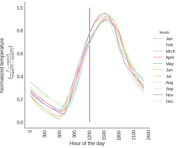
So it seems like 3pm is the hottest hour in Austin, but not noon (red vertical line). An explanation can be found here.
