This jupyter notbook intends to record how the facet title from seaborn FacetGrid can be aligned as ggplot2 in R (Because I always forget).
%matplotlib inline

import matplotlib.pyplot as plt
import seaborn as sns
import pandas as pd
sns.set_style('white')
First, lets read the data and make some labels for facetting later.
The data is a dataset that stores information from 1038 cameras.
url = 'https://perso.telecom-paristech.fr/eagan/class/igr204/data/Camera.csv'
df = pd.read_csv(url,sep=';',skiprows=[1]) \
    .assign(price_type = lambda d: map(lambda x: 'Expensive' if x>1000 else 'Cheap', d.Price))\
    .assign(year_type = lambda d: map(lambda x: 'Before 2002' if x < 2002 else 'After 2002', d['Release date']))
df.head()
| Model | Release date | Max resolution | Low resolution | Effective pixels | Zoom wide (W) | Zoom tele (T) | Normal focus range | Macro focus range | Storage included | Weight (inc. batteries) | Dimensions | Price | price_type | year_type | |
|---|---|---|---|---|---|---|---|---|---|---|---|---|---|---|---|
| 0 | Agfa ePhoto 1280 | 1997 | 1024.0 | 640.0 | 0.0 | 38.0 | 114.0 | 70.0 | 40.0 | 4.0 | 420.0 | 95.0 | 179.0 | Cheap | Before 2002 |
| 1 | Agfa ePhoto 1680 | 1998 | 1280.0 | 640.0 | 1.0 | 38.0 | 114.0 | 50.0 | 0.0 | 4.0 | 420.0 | 158.0 | 179.0 | Cheap | Before 2002 |
| 2 | Agfa ePhoto CL18 | 2000 | 640.0 | 0.0 | 0.0 | 45.0 | 45.0 | 0.0 | 0.0 | 2.0 | 0.0 | 0.0 | 179.0 | Cheap | Before 2002 |
| 3 | Agfa ePhoto CL30 | 1999 | 1152.0 | 640.0 | 0.0 | 35.0 | 35.0 | 0.0 | 0.0 | 4.0 | 0.0 | 0.0 | 269.0 | Cheap | Before 2002 |
| 4 | Agfa ePhoto CL30 Clik! | 1999 | 1152.0 | 640.0 | 0.0 | 43.0 | 43.0 | 50.0 | 0.0 | 40.0 | 300.0 | 128.0 | 1299.0 | Expensive | Before 2002 |
with sns.plotting_context('paper', font_scale = 1.3):
    p = sns.FacetGrid(data = df,
                      col = 'year_type',
                      row = 'price_type')
p.map(plt.scatter, 'Effective pixels','Dimensions')
<seaborn.axisgrid.FacetGrid at 0x7f03f98bf690>

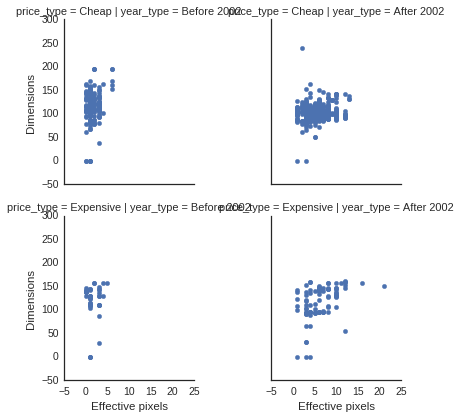
The default seaborn FacetGrid generate an uglya and messy title template. I personally like the facetgrid style in ggplot2 better. There’s option in seaborn
with sns.plotting_context('paper', font_scale = 1.3):
    p = sns.FacetGrid(data = df,
                      col = 'year_type',
                      row = 'price_type',
                      margin_titles=True)
p.map(plt.scatter, 'Effective pixels','Dimensions')
p.set_titles(row_template = '{row_name}', col_template = '{col_name}')
<seaborn.axisgrid.FacetGrid at 0x7f03f95fe0d0>

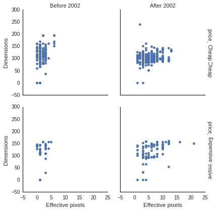
There will be some overlapping on the row titles for some reason.
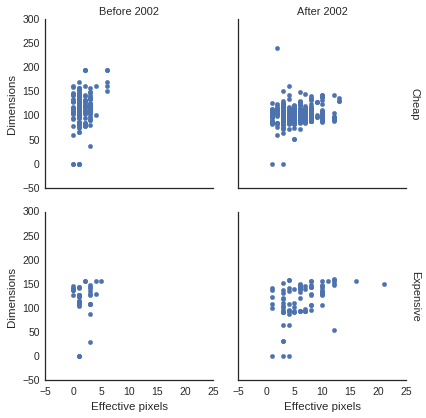
This is addressed in a github issue, and I tend to look at the issue every time I do the same thing.
with sns.plotting_context('paper', font_scale = 1.3):
    p = sns.FacetGrid(data = df,
                      col = 'year_type',
                      row = 'price_type',
                      margin_titles=True)
p.map(plt.scatter, 'Effective pixels','Dimensions')
[plt.setp(ax.texts, text="") for ax in p.axes.flat] # remove the original texts
                                                    # important to add this before setting titles
p.set_titles(row_template = '{row_name}', col_template = '{col_name}')
<seaborn.axisgrid.FacetGrid at 0x7f03f8e5ea50>

