Principle component analysis (PCA) is a must-use exploratory anlaysis tools in informatic sciences. And usually can be helpful in identifying how samples are clustered and what features introduced most variance among samples. An article that I have read recently provided an excellent example of how PCA can be performed in excel. This would be mind blowing to anyone like me, who contempts the usage of excel.
In here, I would like to use R to demonstrate how pca can be done without using the standard prcomp function as well as to strengthen my understanding on PCA.
#load library
library(dplyr)
library(data.table)
library(ggplot2)

set.seed(10) #reporoducible

#simulated data
# center at mean
a = matrix(rnorm(40,1:10),8) %>%
	apply(2,function(x) x-mean(x))  #scale each columns
a
##            [,1]       [,2]      [,3]       [,4]       [,5]
## [1,] -3.1033267  2.1790325  1.209696 -1.5794728 -2.0270496
## [2,] -2.3063254  4.5492268  2.969489  0.3120637 -1.8106900
## [3,] -2.4934034 -3.0925153  5.090161  0.9981698 -2.3755596
## [4,] -0.7212405 -2.4385133  5.647618  1.8135664 -1.4311303
## [5,]  1.1724723 -2.4325284 -4.431671  3.5839642  1.3664712
## [6,]  2.2677215 -0.2068501 -5.020647  4.4319447  0.2452973
## [7,]  1.6698510  0.5470953 -2.510226 -6.1680152  2.6798400
## [8,]  3.5142512  0.8950525 -2.954421 -3.3922208  3.3528210
cov(a)
##           [,1]       [,2]       [,3]       [,4]       [,5]
## [1,]  6.191805 -1.0066783 -8.3605042 -1.0833179  5.1197227
## [2,] -1.006678  6.8591512 -0.7953364 -3.6538409 -0.1036576
## [3,] -8.360504 -0.7953364 18.2804297  0.2443067 -7.4176214
## [4,] -1.083318 -3.6538409  0.2443067 12.7022845 -3.4640454
## [5,]  5.119723 -0.1036576 -7.4176214 -3.4640454  5.0613302
eigen(cov(a)) # eigen vectors of the covariance matrix are the principle components
## $values
## [1] 26.6438538 14.6551549  6.2003003  1.4618961  0.1337959
##
## $vectors
##             [,1]        [,2]       [,3]      [,4]        [,5]
## [1,]  0.43071650 -0.07326935 -0.2687093 0.6854321  0.51681041
## [2,]  0.03673689  0.39997155  0.8290116 0.3853576 -0.05396735
## [3,] -0.79308362  0.20952906 -0.2953572 0.4796553 -0.09905006
## [4,] -0.15629592 -0.88202683  0.2951085 0.2679626 -0.19674154
## [5,]  0.39965443  0.11305136 -0.2573134 0.2825051 -0.82551583
# eigen value is the variance that is explained by each


eVal <- eigen(cov(a))$value
varianceExplained <- eVal/sum(eVal)
varianceExplained
## [1] 0.542699935 0.298506051 0.126291887 0.029776882 0.002725244
eVec <-  eigen(cov(a))$vector
rotation <- eVec %>%
	data.table %>%
	setnames(sapply(1:ncol(.),function(x) paste0('PC',x)))


# transformed data matrix
# this can alternatively done by a %*% eVec
PC1 <- rep(0,nrow(a))
PC2 <- rep(0,nrow(a))
for (i in 1:length(PC1)){
	PC1[i] <- sum(eVec[,1]*a[i,])
	PC2[i] <- sum(eVec[,2]*a[i,])
}
result <- data.table(PC1,PC2,
		method='manual',
		sample=1:length(PC1))
result
##          PC1       PC2 method sample
## 1: -2.779247  2.516373 manual      1
## 2: -3.953726  2.130789 manual      2
## 3: -6.329896 -1.136664 manual      3
## 4: -5.734678 -1.500556 manual      4
## 5:  3.916282 -4.994083 manual      5
## 6:  4.356278 -5.182223 manual      6
## 7:  4.765196  5.313823 manual      7
## 8:  5.759791  2.852542 manual      8
# using standard prcomp function
pca <- prcomp(a)
summary(pca)$importance # variance explained
##                             PC1      PC2     PC3      PC4       PC5
## Standard deviation     5.161768 3.828205 2.49004 1.209089 0.3657812
## Proportion of Variance 0.542700 0.298510 0.12629 0.029780 0.0027300
## Cumulative Proportion  0.542700 0.841210 0.96750 0.997270 1.0000000
# combine result
resultTable <- pca$x %>%
data.table %>%
select(PC1,PC2) %>%
mutate(method = 'prcomp',
sample = 1:nrow(.)) %>%
rbind(result)
# visualize in biplot
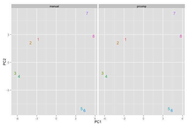
p1 <- ggplot() +
geom_text(data=resultTable,
aes(x=PC1,y=PC2,label=sample,
color=factor(sample))) +
facet_wrap(~method)+
theme(legend.position = 'none')
p1
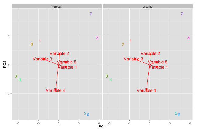
#sometimes inverted PCs due to random assign of negative sign
#now add arrow for rotation
library(grid)
variables = rep(sapply(1:ncol(a), function(x) paste('Variable',x)))
rotationData <- data.table(rotation,method='manual',var = variables) %>%
		rbind(data.table(pca$rotation,method='prcomp',var = variables))

p1 + geom_segment(data = rotationData,
		aes(x = 0,y=0,xend = PC1*3, yend = PC2*3),
		color='red' ,
		arrow = arrow(length = unit(0.25, "cm"),
				type = "closed",
				angle = 30)) +
	geom_text(data=rotationData,aes(x=PC1*3,y=PC2*3,label=var),color='red')
Long story short, R is still better than Excel.
